
The Blue Monotypes
At the end of 2022, a dramatic shift occurred in my monotype work. Artists are constantly evolving, and each decision they make in their artwork pushes them one step closer to a new way of expressing themselves. By this point, I had already been considering how I could change my process. How could I make my monotypes bolder?

The answer had been in my sketchbook for a number of years. I had begun exploring blue ink landscapes back in 2019 when I suddenly picked up a blue ballpoint pen to draw my version of a section of a Corot painting. I don’t think my choice was random; I believe I was influenced by several of his works hanging in what I call the Corot Gallery at the Met. A few of his late works majestically hung on the wall, and their silvery grey-blue tonality may have influenced my decision. I continued exploring blue in my ghost print drawings, seeing it as a way to make them contemporary while challenging common perceptions of landscapes being related to the color green. It was in 2021, after my trip to Amsterdam, that blue became prevalent in my mind. I had seen the blue-painted Dutch porcelain and tiles at the Rijksmuseum, and more than ever, I wanted to keep exploring this color. During that trip, I began a drawing in my sketchbook while having lunch next to a canal. Soon, a second drawing would pop up on the facing page, again my rendition of a section of a Corot painting.

Blue was becoming increasingly appealing to me, so at the end of 2022, I decided to take a chance on the color for my monotypes. The idea was exciting; mixing the right shade of blue was satisfying, but there was no guarantee that a monotype in my technique would be successful. I pre-mixed my ink the night before my printing session, as I dislike wasting time when I get to work. Time at the press is very limited, so I approach it with a prepared game plan in mind.
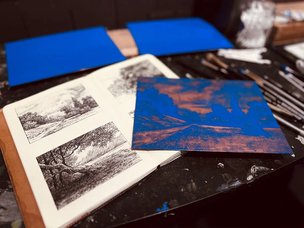
Armed with ink, and with plenty of thumbnail sketchers in my sketchbook I began my new series of blue monotypes. I soon learned that just like in oil painting, some colors behave differently and require specific attention. That night I learned titanium white in the mixture was making the ink stiff and not wiping away as easily as my usual dark color mix. However, I learned to adapt and find ways of working around it.

The second time I worked with this mixture of blue, I realized I needed to add a couple of drops of burnt plate oil to loosen things up. That adjustment improved the process, and since then, I have returned to this color on numerous occasions. My blue series of monotypes continues to develop, but now I am ready to branch out to other colors and see how they affect the mood of my landscapes. Below is a small sample of the blue monotypes.

Remembranza, Central Park, 2022, monotype on Rives Heavyweight paper, image 6 x 8 inches, sheet 8 1/2 x 11 inches

Arbolado Azul I, 2022, monotype on Rives Heavyweight paper, image 8 x 6 inches, sheet 11 x 8 1/2 inches
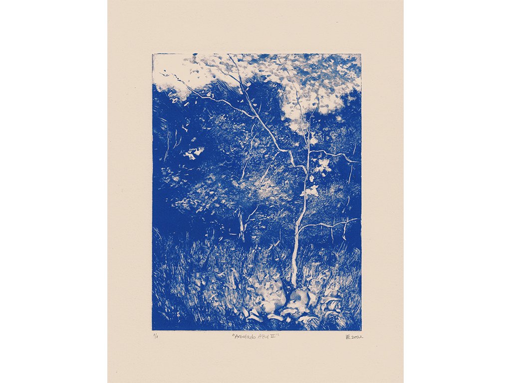
Arbolado Azul II, 2022, monotype on Rives Heavyweight paper, image 8 x 6 inches, sheet 11 x 8 1/2 inches

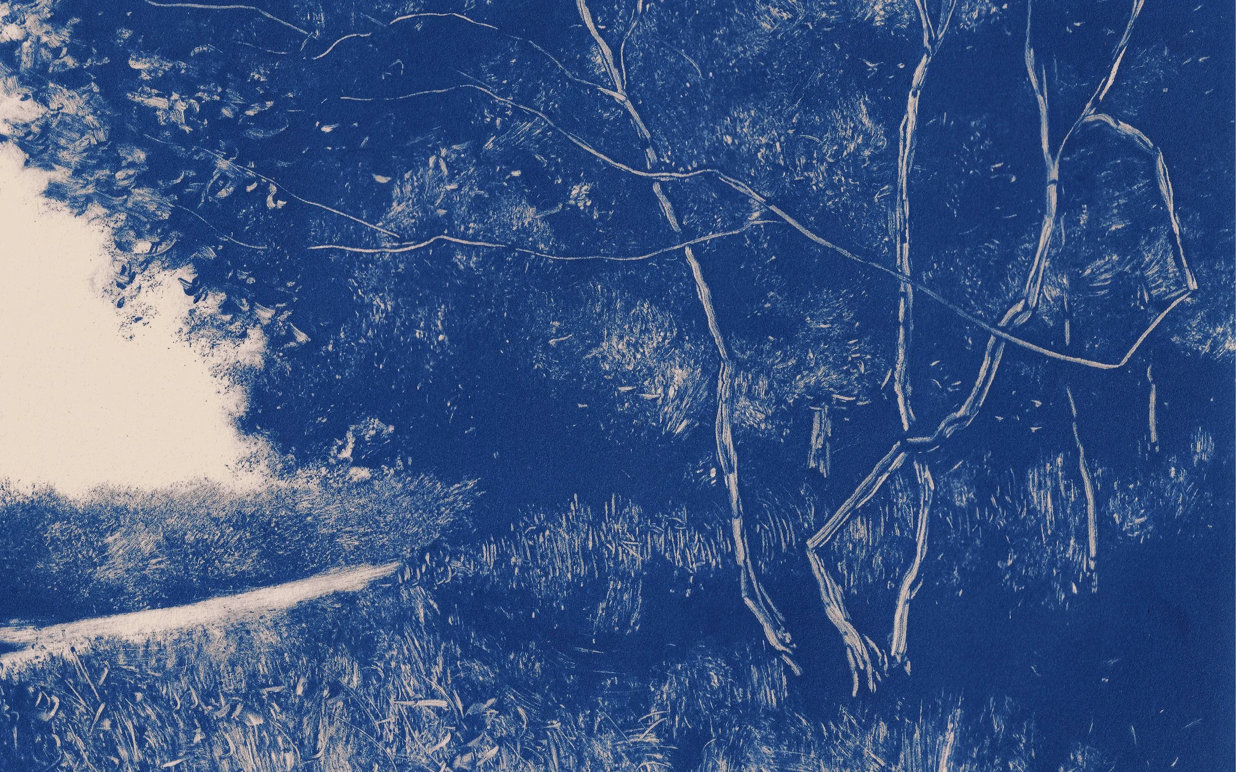
Along a Trail III, 2022, monotype on Rives Heavyweight paper, image 8 x 6 inches, sheet 11 x 8 1/2 inches

In the Shade of Trees, 2023, monotype on Rives Heavyweight paper, image 6 x 8 inches, sheet 8 1/2 x 11 inches