
Bit by a Green Bug
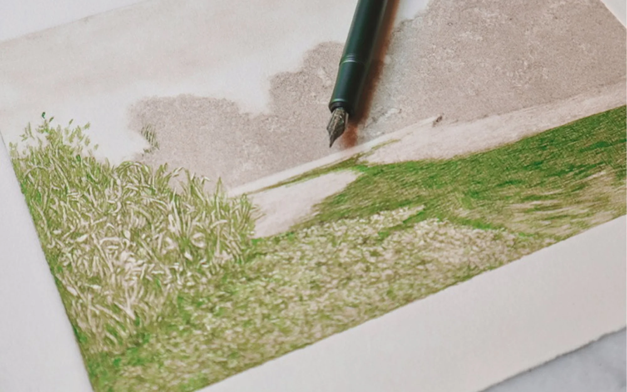
Part of the joy of being an artist is witnessing your work evolve and grow naturally with you. Each brushstroke, pen line, or color choice has a lasting impact on the next, shaping the piece and even igniting the start of a new series. When I began drawing on top of one of my ghost prints in 2020, I was not aware that it would mark the beginning of a significant new series in my artistic output. Two years earlier, I had been contemplating how to repurpose my stack of monotype ghost prints. Initially, I considered mounting them on wood panels and creating egg tempera paintings from them. After my first unsuccessful attempt, that idea was put on hold, but I still desired to do something with the prints. Two years later, I decided to buy a fountain pen and thought, "Why not draw on top of them?" This decision led to the ongoing series of ghost print drawings, which continues to evolve as I introduce new colors.
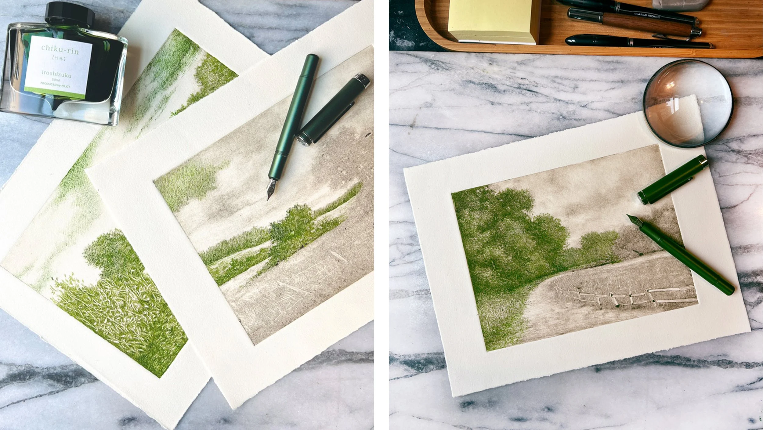
Over the years, I have experimented with various colors, choosing them based on personal preference and spontaneous whims. The challenge always lies in how the ink color will interact with the faded dark ink color of the print. Some colors are bold and dominate the dark base, while others are subdued by it, requiring extra effort to make them stand out. Each time I try a new color, it presents a unique challenge. Fortunately, I have not encountered a disaster so far, and I hope not to. In a recent instance I thought I had ruined a good print while working with this green. I had previously worked with two different greens, but they were deeper and earthier hues. For months, I had been searching for something more chromatic and light. The color also needed to be warm, as I found many green inks to have too much of a blue undertone, which doesn't appeal to me.
I recently discovered this green, Chiku-Rin, from Pilot’s Iroshizuku line, inspired by the seasons and landscapes of Japan. I felt uneasy bringing this ink home, fearing that the color would be too transparent and weak to stand up to the print's surface. After laying down the first areas of color, I began to sweat, thinking I had made a mistake. However, I continued working layering my lines, and before long, I saw the drawing come to alive.
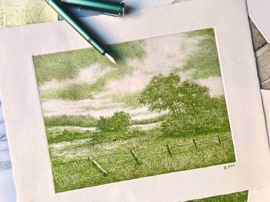
The introduction of this new color has brought a fresh light (no pun intended) to the series, one I didn't realize was needed. To my delight, this color was well-received by many; the positive responses on Instagram affirmed that I am onto something good. In about a month, I have completed three of these green drawings, and I plan on continuing the series as the months progress. A follower messaged me, asking if I change the color according to the seasons—will spring bring a different color? I don't choose colors based on seasons; that might be a little too predictable and premeditated for my liking. I prefer to choose colors based on mood and when they pop into my head randomly. Although I enjoyed working on these green drawings, I look forward to seeing what other random colors will make an appearance in the future.
View the full series of ghost print drawings here.