
Quoting the Past: Contemporary Landscape Ballpoint Drawing
In April 2021, I began work on a ballpoint pen drawing of an iconic bridge in Central Park. Initially, I anticipated it would be a longer endeavor, primarily because of its intricate composition and slightly larger scale. Little did I know that this project would extend throughout most of the year. Admittedly, I didn't consistently dedicate weeks at a time to this project, and progress often moved at a snail's pace during the days I did work on it.
Somewhere in the midst of the summer months, I initiated discussions with Zebra Pens USA, exploring the possibility of collaborating on a blog post. The idea struck me: why not showcase this very drawing as a prime example of my craft using their ballpoint pens? This collaboration with Zebra became a significant driving force behind my determination to complete the artwork. Having a tangible deadline served as a crucial motivator, helping me stay focused and significantly more productive.
Fast forward to September 27, 2021, when my blog post, "Quoting the Past: Contemporary Landscape Ballpoint Drawing," was published. Read the original blog post below.
Going back to my days as an art student, I always looked at the art of the past for inspiration and guidance. When working on still life paintings I was looking at Chardin and Vermeer, and as I moved to landscape imagery, I researched the different art movements through art history surrounding this subject. The French painters of the Barbizon School and the Impressionists served as the main source of inspiration for my approach to painting the landscape.
After several years of working with oil paint, I was in search of a new approach, something that would make my work feel more contemporary. I took a pause from painting and to keep my brain sharp and my hands busy I picked up drawing. I began working in my sketchbook more and more. I tried different pens, not just for the quality of line and tone, but also because of their design. It’s always nice to have a good-looking product in your hands.
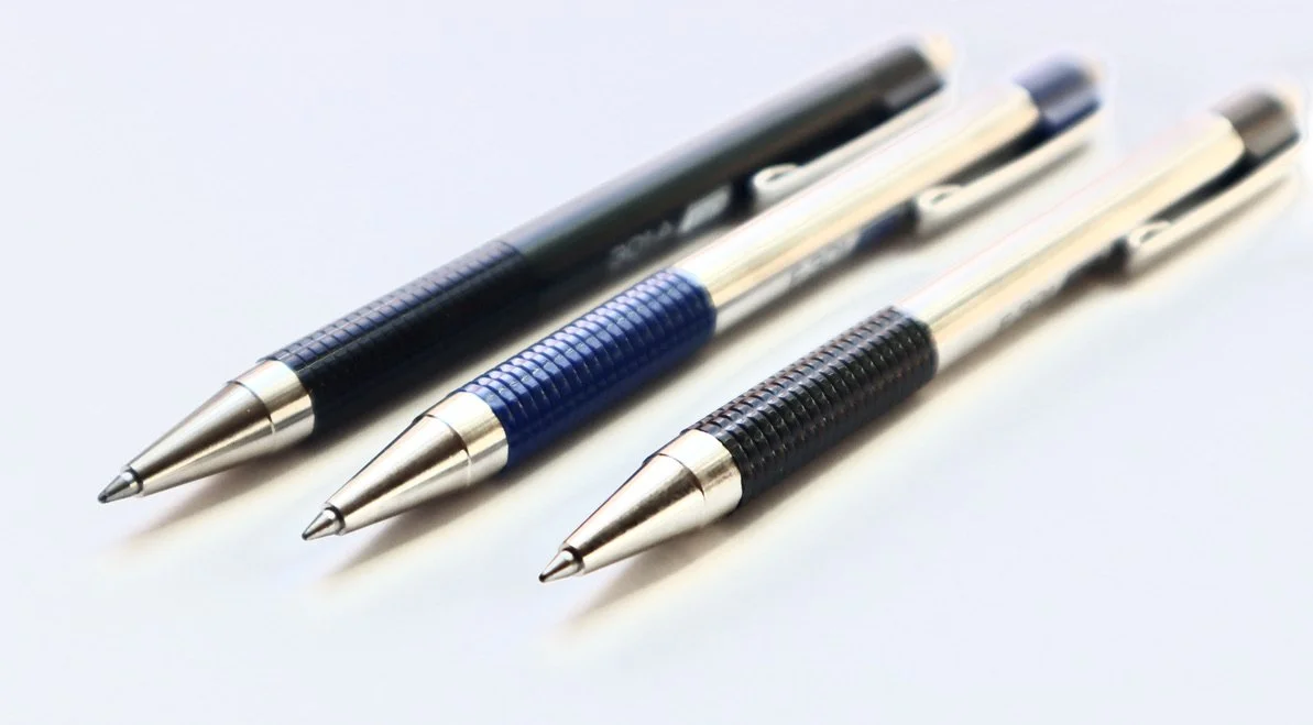
I came across the STEEL F-301 Ballpoint Retractable Pen, a sharp looking ballpoint pen with a stainless-steel barrel which called my attention due to its slick design. Holding it felt great, it was light weight, and the shape and size fit nicely in my hand. I was able to test the pen in the store, and automatically I fell in love with its glide. I didn’t see any skipping on the paper, and I realized that I could use it in my drawings. From that point on the STEEL F-301 has become an important tool and companion.
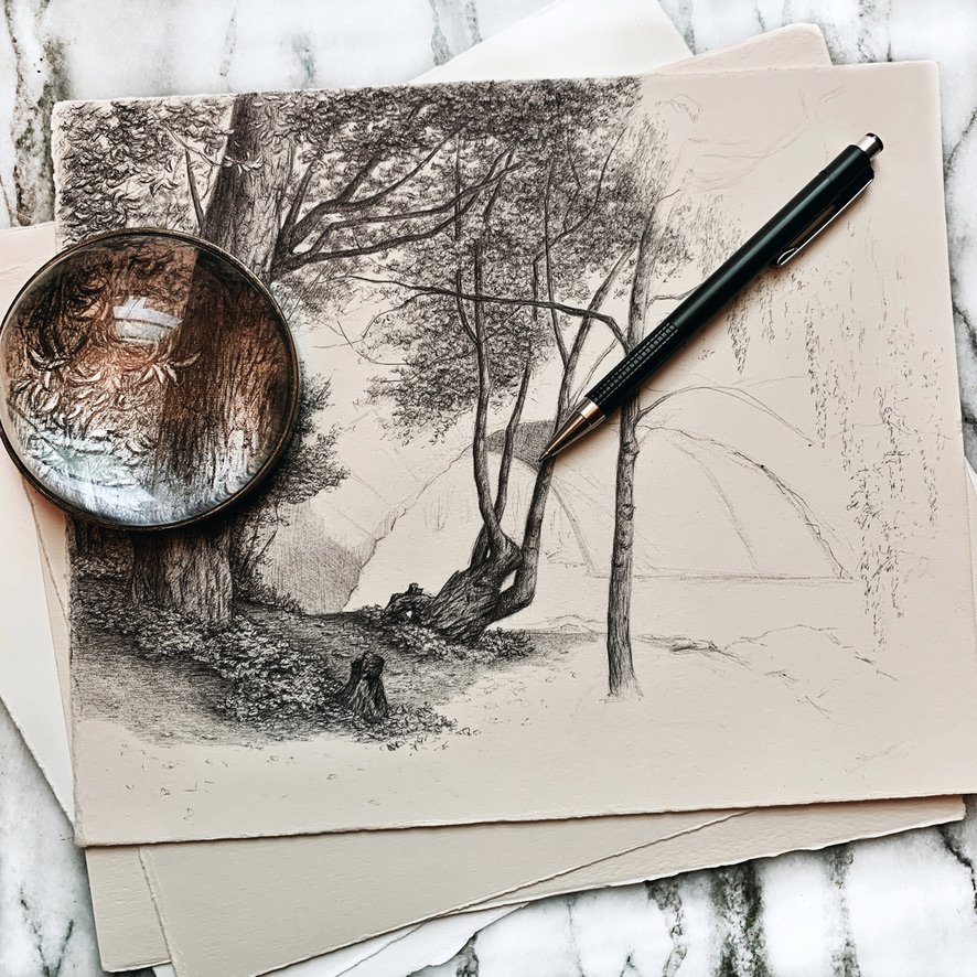
Early in the year I decided to make a full drawing outside of my sketchbook. This drawing, on cotton rag paper, would be used as an exhibition piece. I picked up a sister pen of the STEEL F-301, the 301-A Ballpoint Retractable Pen from Zebra Pen. This ballpoint pen offers the same qualities of the STEEL F-301 but features an aluminum barrel instead of stainless-steel barrel.
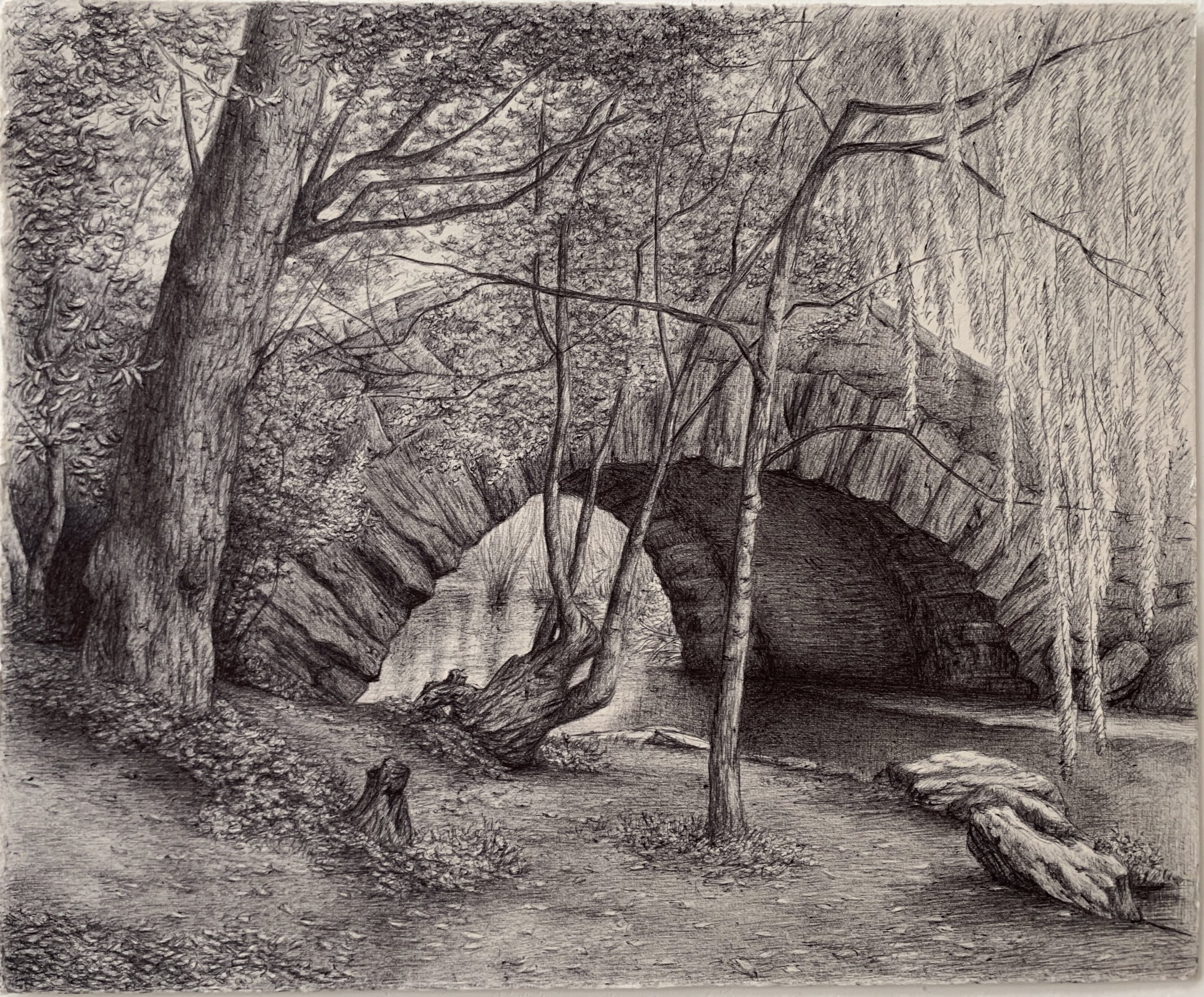
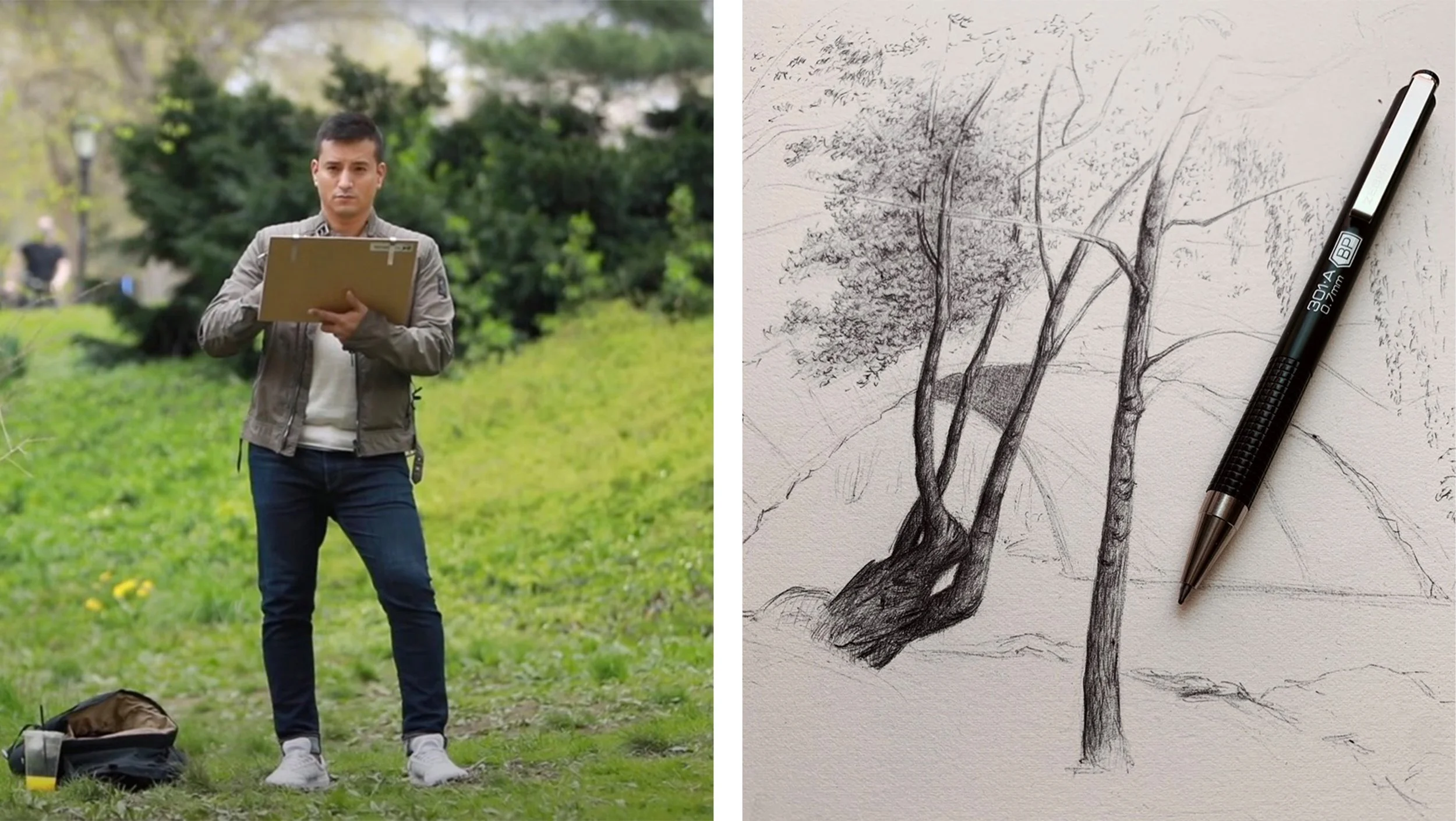
With this new pen, I went out to Central Park to capture the perfect scene. I settled on a view of Gapstow Bridge, which from my point of view was reminiscent of a Corot painting. I began my drawing onsite by quickly sketching the composition. Using gestural lines, I moved about the paper trying to capture the whole effect. The key is in the movement of your wrist and the amount of pressure you apply on the pen. Always keep it light and keep it moving. Once you have the composition that works for you, you can begin by defining shapes better.

After getting my compositional lines on the paper, I continued to work on the drawing in my studio using a reference photo. At this point, I chose one element of the drawing I was very sure of, and I began to further define its shape and tone by lightly layering lines. I always start light and move on to dark tones towards the end. This allows me to make changes as I go along. It also builds soft tones and gives the drawing the feeling of light and atmosphere.

My work style focuses on the effects of light. To achieve this, I first began blocking in large areas of the drawing by using soft, light lines to build an even tone. From there, I added the darker elements; the closer things are to the foreground, the darker things get. This gives the drawing an atmospheric effect.The lighter tones recede in space, while the darker and sharper lines push forward in space.

Landscapes can be overwhelming to depict because there is a lot of information to process. It all comes down to simplifying and problem solving to reach a certain outcome. We are all aware that trees are made up of million leaves. We all know the general shape of a leaf, but are you going to draw them all, one by one? That would take too long, and it would also make your drawing look stiff.
What you are really seeing are groups of texture, and it’s always good to find these groups and break down the drawing into these larger shapes.
Some of the things I always keep in mind when working with a ballpoint pen are:
Always clean the tip every few seconds on a separate piece of paper or paper towel to avoid any ink bleeding and keep clear, crisp lines.
Hold the pen lightly like as if holding a magic wand. Hold the barrel at the middle or towards the end. Do not hold the pen tight towards the tip; that hand placement is better for writing.
To get soft and light lines, I always watch how much weight or force I’m applying on the pen. Since I don’t hold it tight, I let the pen fall on its own weight and let it gently caress the surface of the paper.
Patience and practice are crucial!

I hope you enjoyed learning more about my journey as an artist and my tips for drawing with a ballpoint pen. To see more of technique in action follow me on Instagram, where I share photos and videos of my work in progress.